Seven real therapist websites: what was wrong, what we changed, and what happened. From the person who built them.
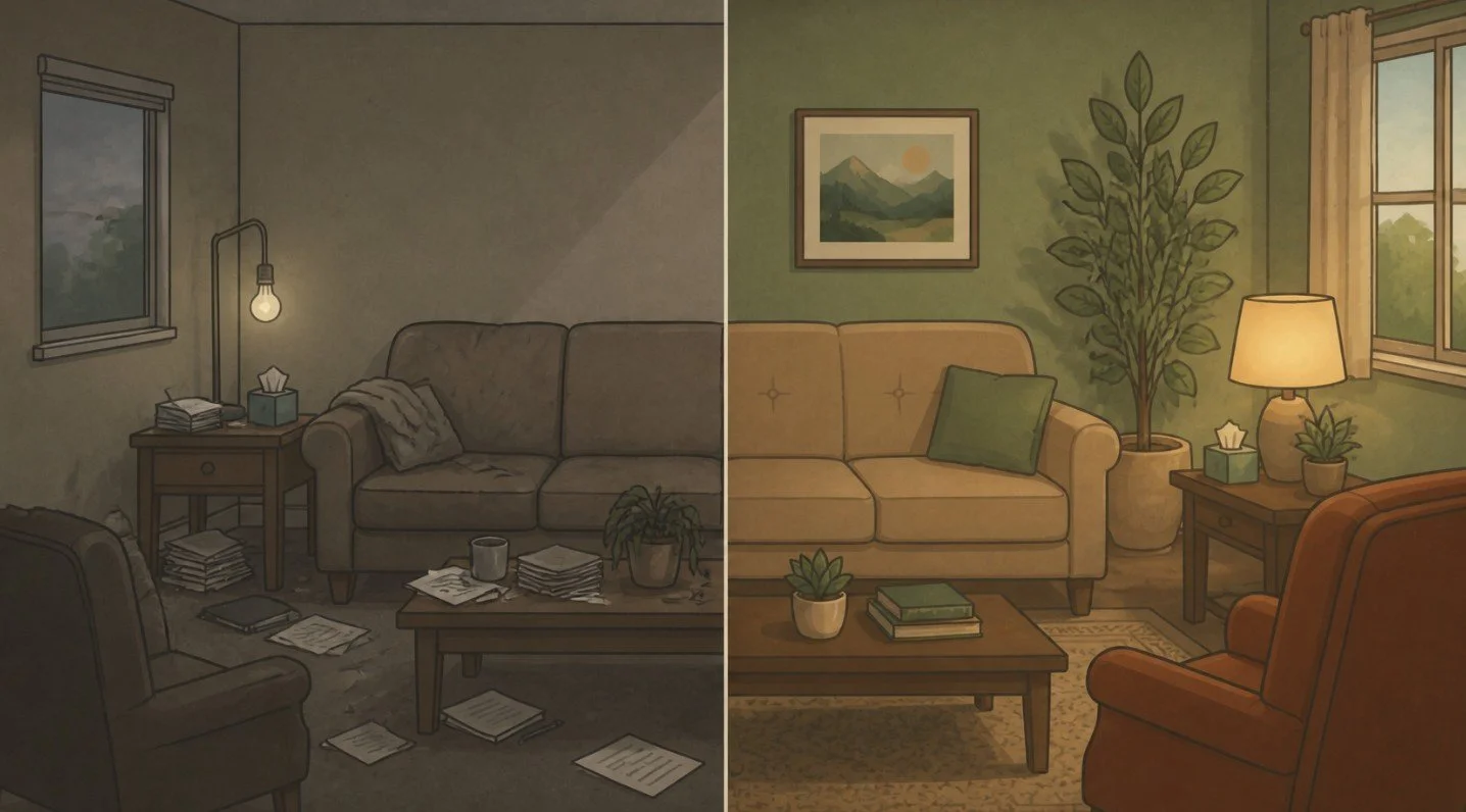
Most lists of "best therapist websites" are written by people who have never built one. Somebody at a template company opens forty tabs, picks the prettiest, and calls it a day. You get a gallery of nice fonts and no idea whether any of those sites bring in a single client.
This is not that list.
Every site below is one I worked on. For each one I'll show you what was wrong before, what we changed, and what happened after, with numbers where I have them and an honest "too soon to say" where I don't. If you're sizing up your own site and trying to figure out what "good" even means, this is what it looks like in practice.
A quick note on what I mean by good. A good therapist website does four things: it looks as polished and intentional as your practice actually is, it tells the right person it’s for them within a few seconds, it makes it obvious how to book, and it works on a phone. A beautiful site that fails the other three isn’t doing its job. Neither is a functional one that looks like a template. Keep all four in mind as you scroll.
1. Unfold Psychology: four offices, one very confusing menu
Before: Unfold is a group practice with offices in San Francisco, Oakland, Corte Madera and San Jose, doing therapy, assessments and forensic work. Their site had been redone several times and still wasn't working. It also looked nothing like a four-office psychology practice; it looked thrown together. The menu had so many items you couldn't find anything. Pages rambled. Rates and insurance were buried in PDFs. The free consultation wasn't mentioned anywhere. And the "Book Here" button sent brand-new visitors to a login page for existing clients.
When we audited it, about two new clients a month were coming from the website. Google Analytics had never been set up, so nobody knew that.
What we did: We rebuilt it from scratch around the people who actually visit, with a clean, professional design that finally matches a practice of its size. The homepage now opens with three doors: therapy for yourself, help for your child or teen, or a court or custody matter. Every page was rewritten from keyword research, with a Rates & Insurance page in plain text, FAQs on every service page, and a free 15-minute consult offered everywhere. We built it in WordPress with a custom system so the office team adds a new clinician once and they show up on every page they belong on.
After: In the first seven weeks, 41 consult requests came through the website form, about 25 a month, up from about two. Visitors tapped to call or text 19 more times. Their four Google Business Profiles now send roughly five times as many people to the site (about 54 a month, up from 11) and bring in more than three times as many calls.
Same practice, same clinicians, same four offices. What changed was everything a new client meets before they reach out: they can find the practice on Google, tell in seconds which kind of help is theirs, see fees and insurance without opening a PDF, and request a free consult from any page. That’s the difference between two inquiries a month and twenty-five.
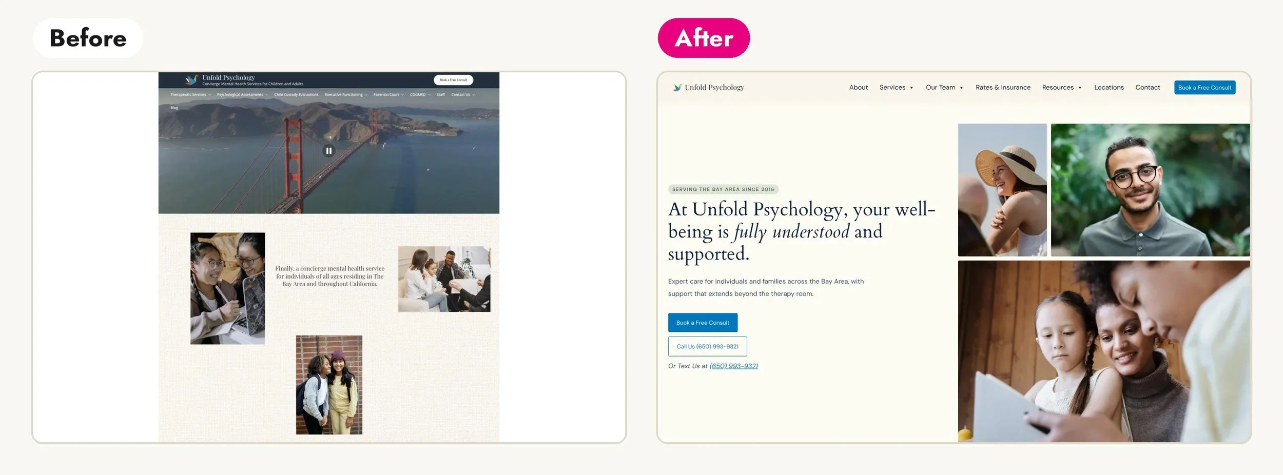
Read the full Unfold Psychology case study →
2. Aaron Martin Therapy: a great story that the website wasn't telling
Before: Aaron is an LMFT in San Francisco who helps gay men get out of the anxious spiral. He's been quoted in the Los Angeles Times. His own story is a big part of why clients choose him. The design was decent but cluttered. His homepage opened with "Hey, I'm Aaron," and his services lived in short blog posts that Google showed 207 times in a year without a single click. In twelve months the site got 118 clicks from Google, and nearly every one was from someone already searching his name.
So the site worked for people who already knew his name. Aaron needed it to reach the ones who didn’t: gay men searching for help with anxiety who had never heard of him.
What we did: This one was an Audit & Refresh, not a rebuild. We kept his main color scheme, his fonts and his logo. We rewrote the homepage around the person he wants to reach, with a headline that names what that person is living with and a booking button front and center. We built three new service pages around the phrases his clients actually search (anxiety therapy for gay men, queer therapist in San Francisco, individual therapy). We gave him a real About page with his training, license and press. And we set up booking-click tracking, because the old site had no way to tell whether anyone ever clicked to book.
After: The site launched at the end of September, so this is one month of data. In that first month, five people clicked to book a consult, and for the first time we know which page sent each one. Google showed the site for 43 different searches, including "gay therapist san francisco" and "therapist san francisco," where before it showed up almost only for his name. The three new service pages are indexed and getting impressions but no clicks yet, which is the normal order of things: impressions first, clicks as the pages climb in the rankings. Aaron said the finished site “looks and sounds like him, not someone else.”
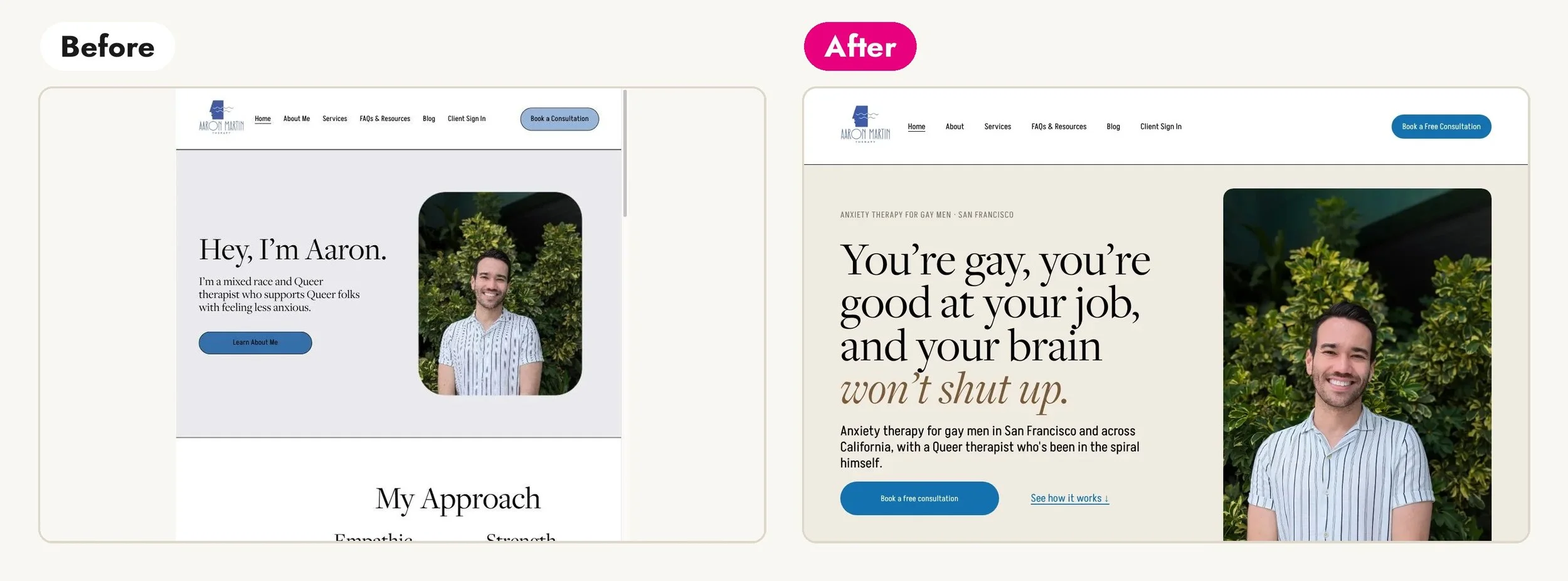
Read the full Aaron Martin Therapy case study →
3. Elana Story, LCSW: a 2018 Wix site for a 2026 practice
Before: Elana is a queer, gender-expansive therapist in Oakland who works with queer and trans folks healing from trauma, and with chosen families and nontraditional family structures. Her practice is irreverent, direct and radically affirming. Her website was a Wix site from 2018: mostly empty color blocks and the kind of general therapy language you could paste onto any site in the country. It looked dated and unfinished, nothing like the experienced, distinctive clinician behind it. Nothing set her apart from the many other queer therapists in the Bay Area, and most of her clients were coming from networking and referrals.
What we did: A mini brand first (two directions built from her own words; she picked the plum-and-cream one with a heart-and-roots illustration). Then we rewrote every page in her voice, candid and funny and permission-giving. And we gave each way she works its own page, including one for Chosen Family Healing, which is family therapy for adult relationships, from siblings to roommates. That's a service nothing off the shelf describes, so we named it ourselves.
After: The site reads the way she talks to clients and shows the full range of her work, from one-on-one trauma therapy to consultations for other therapists. She owns and edits it herself. And that Chosen Family Healing page, the one for a service nobody had a name for? Search "chosen family healing" today and it's on page one, second only to a Psychology Today article, and Google's AI Overview names her. Search the generic version of what she does and she's one of hundreds. Specific wins.
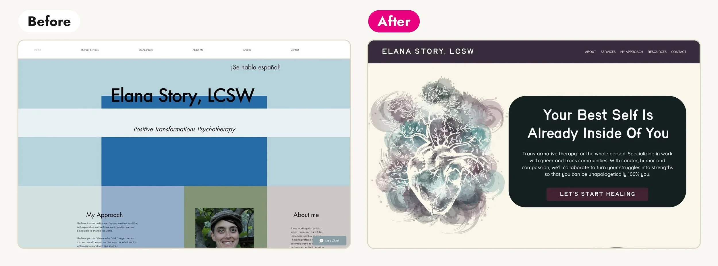
Read the full Elana Story case study →
4. Inward Roots Collective: one therapist, four audiences, zero of them being spoken to
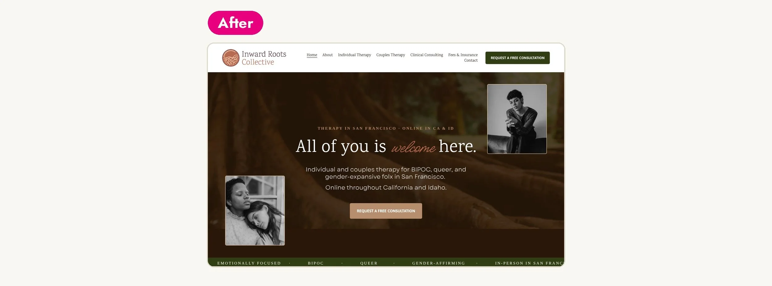
Before: Key Bernard is two rare things at once: a Black, non-binary, trans therapist offering identity-affirming care, and a licensed attorney who consults for agencies serving justice-involved populations. None of that came through online. The old site was an outdated Wix page with a logo that represented neither who Key is nor the very different people they serve. It looked like a placeholder, not the practice of a licensed clinician who is also an attorney. It spoke to no one in particular, when the whole point was to speak very specifically to people who are usually an afterthought.
What we did: A full rebrand, then a Squarespace site written for four different readers without watering down the voice: individuals seeking identity-affirming therapy ("you don't have to translate yourself here"), couples, the nonprofits and county agencies that hire Key as a clinical consultant, and the clinicians Key will supervise as the collective grows. We even built the Supervision page now so it's ready to publish the day Key brings on associates.
After: Someone looking for identity-affirming therapy feels understood the moment they land. An agency lead navigating justice-involved care sees that Key speaks their language too. Same site, two worlds, each with its own door. This is the fix for the problem I see on almost every established practice's homepage: trying to talk to everyone at once and reaching no one.
Read the full Inward Roots Collective case study →
5. Collective Corazón: a site that could have belonged to anybody
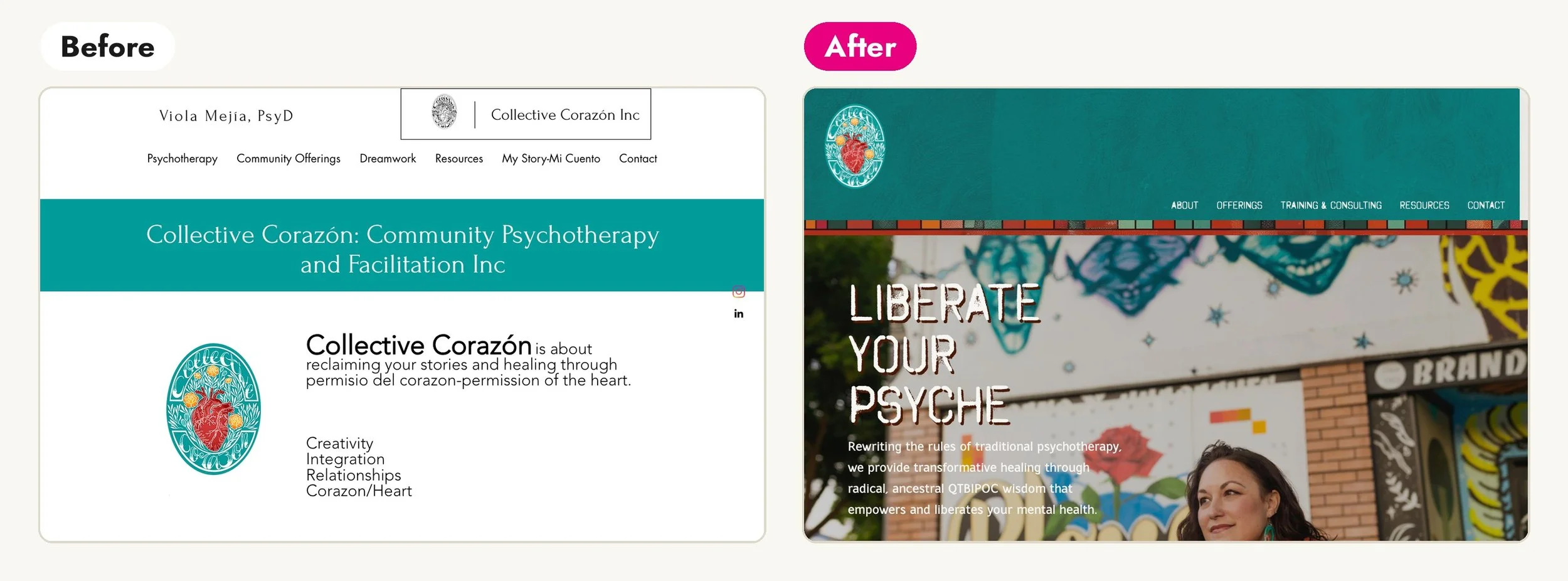
Before: Viola Mejia is a psychotherapist in Oakland whose practice is rooted in her Chicana identity and her anti-capitalist values. Her website was generic stock visuals and copy that didn't sound like her. Nothing about it communicated the depth or the uniqueness of what she offers. It looked like a therapist website. It didn't look like hers.
What we did: A full brand and site rebuild. Traditional Mexican artwork and motifs woven in as design elements. New copy in a voice that reflects her values, including the anti-capitalist lens most therapist sites would sand off. Images chosen for the specific people she most wants to work with.
After: Viola told me the clients reaching out to her now are much more aligned than they used to be. That's the whole point of being specific. A site built for everyone attracts everyone, including a lot of people who aren't a fit. A site built for your people attracts your people.
Read the full Collective Corazón case study →
6. Sye Gratz: when you don't need a new website, just a better one
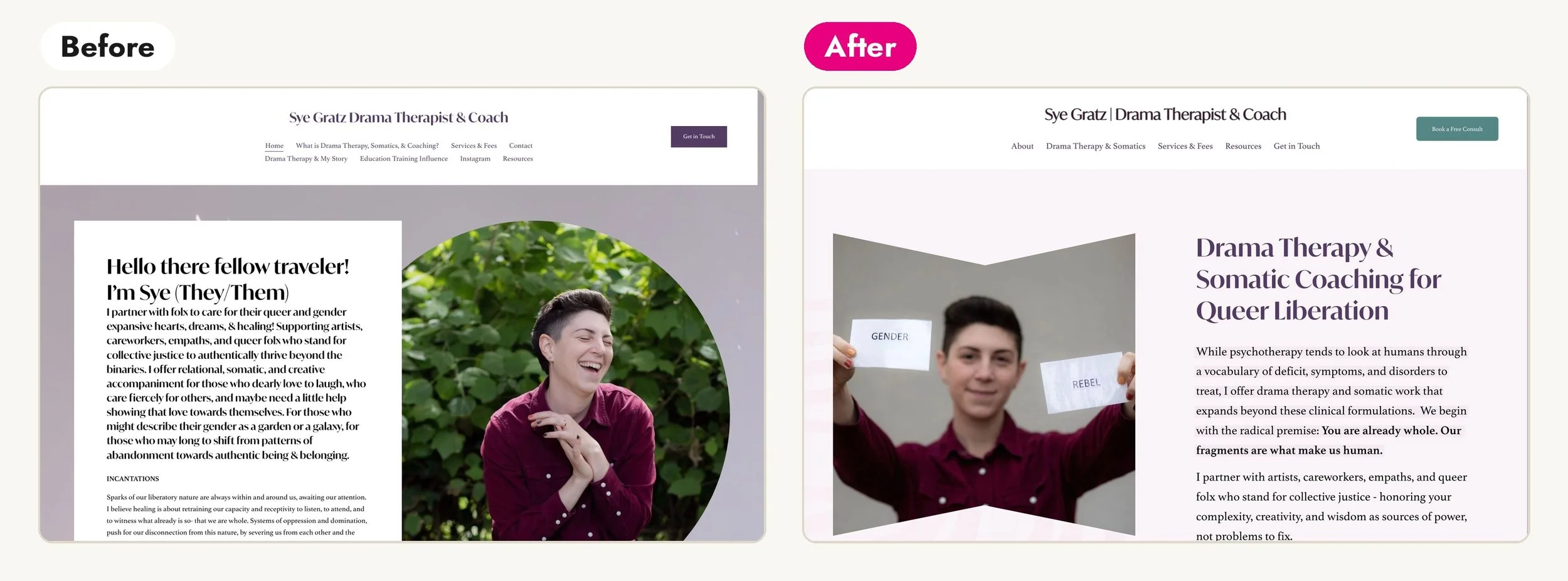
Before: Sye is a drama therapist and somatic coach doing powerful, nontraditional work. The homepage was a wall of text, so visitors couldn't quickly tell what Sye offered or how it could help. The thing that makes Sye different, working as a drama therapist outside the medical model, was mentioned but buried. Navigation was confusing. There was no SEO at all.
What we did: This was an Audit & Refresh, and a good example of why I offer one. Sye didn't need a redesign. We kept what was working, rebuilt the homepage around the client instead of the modality, reframed "drama therapist" from a thing to explain into the core strength of the practice, restructured the content so it flows, and added the titles and descriptions that had been missing.
After: Visitors can tell in seconds what Sye does, how it's different, and whether it's for them. Sye told me the process helped them stop minimizing the parts of their work they'd been quietly treating as deficits. I think about that a lot. Half of what I do is convince therapists that the weird, specific thing about their practice is the thing to lead with.
Read the full Sye Gratz case study →
7. Blue Oak Therapy Center: decades of work, a website from none of them
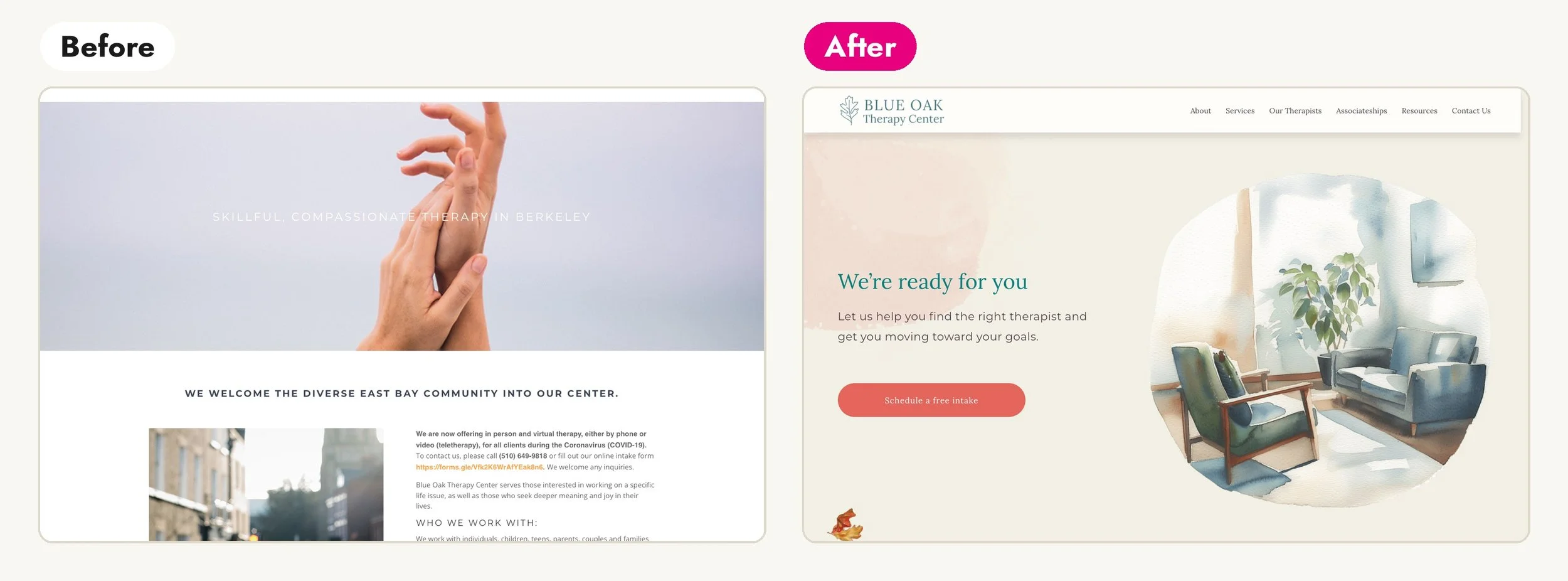
Before: Blue Oak is a long-standing group practice in Berkeley that has been doing important work in its community for decades. The site didn't reflect any of it. The design was the biggest problem: generic and outdated, nothing like the caliber of the practice, with no personality, not enough information about services or the team, and clunky navigation. A stranger landing on it had no way to tell this was a practice with deep roots.
What we did: A full rebrand and rebuild: a new visual identity with its own artwork, new copy in the practice's voice, and a clean layout that puts the services, the clinicians and the community roots up front, with room to grow.
After: For the first time, the website matches the depth of the practice. Potential clients get a clear sense of who Blue Oak is before they ever pick up the phone.
Read the full Blue Oak Therapy Center case study →
What these seven have in common
Different platforms (WordPress, Squarespace, a Wix migration). Different budgets, from a three-week refresh to a full rebuild. Solo practitioners and multi-office groups. And every single one had the same three problems underneath:
The site led with the therapist instead of the client. "Hey, I'm Aaron." A list of modalities. A menu with every service ever offered. All true, none of it what the person at 11pm needs to see first. In every rebuild above, the first thing we did was flip the homepage so it opens with the reader.
The site was vague where it needed to be specific. General therapy language that could belong to anyone. A unique practice described in the same words as every other practice. The fix was always to name the actual person and the actual work: anxiety therapy for gay men, chosen family healing, identity-affirming care, drama therapy outside the medical model. Specific is what gets you found, and specific is what makes someone sit up and think "oh, that's me."
The site didn’t match the caliber of the practice. People can’t judge your clinical skill from a website, so they judge what they can see. A site that looks dated or thrown together makes an experienced clinician look like a side project, and nobody pays a professional rate for a side project. Unfold looked nothing like a four-office practice. Blue Oak looked nothing like a center with decades of history. Elana’s and Key’s sites didn’t look like anyone in particular. In each of those, the new design says what the words say, and says it first.
The fix was never just one of these. Two of the seven were refreshes that kept most of the design, because the design was already working. The rest needed a new look, because the old one was telling visitors the wrong thing about the practice. Good therapist website design is the look, the words and the path to booking, all pulling in the same direction.
What to do with this
If you want to see any of these up close, the full case studies have the before-and-after screenshots, the scrolling homepages and the details I skipped here.
See the full portfolio, with before-and-afters →
And if you looked at one of those "befores" and thought "oh no, that's my site," you're in good company. Every practice above is run by a skilled, respected clinician. Their websites just hadn't kept up with them.
That's fixable. I'd love to hear about your practice and take a look at what you've got. Book a free 15-minute call and we'll figure out together whether you need a refresh, a rebuild, or honestly just a few afternoons with the checklist from my six-things post.